Beautifully detailed portolan charts present historians with a puzzle: How were they made? A mathematical analysis offers some clues.
Get Started for FREE
Sign up with Facebook Sign up with X
I don't have a Facebook or a X account


 Your new post is loading... Your new post is loading...
Beautifully detailed portolan charts present historians with a puzzle: How were they made? A mathematical analysis offers some clues. 
No comment yet.
Sign up to comment
The Vault is Slate's history blog. Like us on Facebook, follow us on Twitter @slatevault, and find us on Tumblr. Find out more about what this space is all about here. Via Skuuppilehdet

From the opium trade routes of the 1900s to CND’s operations in the 1980s, maps reveal the political leylines of history – except when it comes to the holiday islands of San Serriffe, as a new British Library book reveals Via Suvi Salo, Mike Busarello's Digital Storybooks, Skuuppilehdet

"More Americans came into contact with maps during World War II than in any previous moment in American history. From the elaborate and innovative inserts in the National Geographic to the schematic and tactical pictures in newspapers, maps were everywhere. On September 1, 1939, the Nazis invaded Poland, and by the end of the day a map of Europe could not be bought anywhere in the United States. In fact, Rand McNally reported selling more maps and atlases of the European theaters in the first two weeks of September than in all the years since the armistice of 1918. Two years later, the attack on Pearl Harbor again sparked a demand for maps."

Nicole Kearsch's curator insight,
October 14, 2014 2:06 PM
Whenever there is war, Americans want maps. They want to know about where conflict is, how far away from home it is, and why people are being sent to the places they are being sent. With the new map ideas in World War II from Harrison maps were made to better display distance and direction to people. He used different projections in areas. He also drew maps from different places, for example what does Japan look like when you are in Siberia. Transforming flat maps back to having some sort of global shape was exactly what we needed to get away from the old outdated unreliable style of maps.

"Unfortunately, most world political maps aren't telling you the whole story. The idea that the earth's land is cleanly divvied up into nation-states - one country for each of the world's peoples - is more an imaginative ideal than a reality. Read on to learn about five ways your map is lying to you about borders, territories, and even the roster of the world's countries."

Sally Egan's curator insight,
June 23, 2014 6:32 PM
Amazing stories on the World's changing Geopolitical status. Current stories about disputed borders, unrecognised territories and newly declared nations.
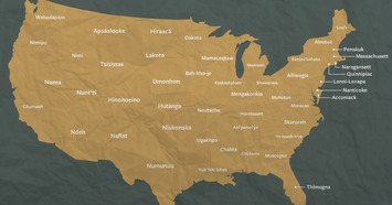
You won't find this map in your U.S. history textbook, but it's a good illustration of where indigenous tribes prospered in pre-Columbian times. It represents the way the "lower 48" would appear if current state territories mirrored the names of the indigenous groups who lived in the vicinity.

"A map marked with crude chinagraph-pencil in the second decade of the 20th Century shows the ambition - and folly - of the 100-year old British-French plan that helped create the modern-day Middle East." Via Seth Dixon, Skuuppilehdet

Seth Dixon's curator insight,
April 8, 2014 12:51 PM
Many of the geopolitical issues that confront the Middle East stem from the secret Sykes-Picot Treaty that divvied up the Ottoman Empire

Drawing on data from the 2010 U.S. Census, the map shows one dot per person, color-coded by race. That's 308,745,538 dots in all.
White: blue dots; African American: green dots; Asian: red; Latino: orange; all others: brown Last year, a pair of researchers from Duke University published a report with a bold title: “The End of the Segregated Century.” U.S. cities, the authors concluded, were less segregated in 2012 than they had been at any point since 1910. But less segregated does not necessarily mean integrated–something this incredible map makes clear in vivd color. The map, created by Dustin Cable at University of Virginia’s Weldon Cooper Center for Public Service, is stunningly comprehensive. Drawing on data from the 2010 U.S. Census, it shows one dot per person, color-coded by race. That’s 308,745,538 dots in all–around 7 GB of visual data. It isn’t the first map to show the country’s ethnic distribution, nor is it the first to show every single citizen, but it is the first to do both, making it the most comprehensive map of race in America ever created. Via Seth Dixon, Michael Miller, Skuuppilehdet

Whitney Souery's curator insight,
May 28, 2014 6:41 PM
We can use maps to think spatially,make connections, and find patterns. Maps can also be used as a way to compare change over time, as in this particular case where maps from the present were compared with maps from over fifty years ago when racial segregation was plainly obvious. Now, however, when we compare past maps with those of the present, the change over time factor becomes clearly evident, revealing why maps are so useful in determining continuities or changes.

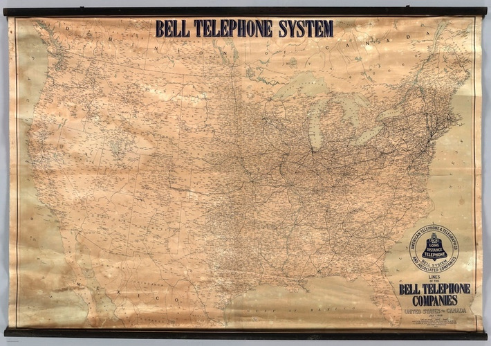
Portolan charts, it was always assumed, were compiled by medieval European mapmakers from contemporary sources. A Dutch doctoral dissertation now disproves this: these nautical charts are impossibly accurate, not just for medieval Europe, also for other likely sources, the Byzantines and the Arabs ... Via Skuuppilehdet

Dr. Vincent Brown, a professor of African and African-American History at Harvard, has made study of the transatlantic slave trade accessible in a new way. Via Community Village Sites, Deanna Dahlsad

The detailed globe, dated 1504, is engraved on two conjoined halves of ostrich eggs and warns of dragons. Via Sara Rosett
|

Curated by Deanna Dahlsad
An opinionated woman obsessed with objects, entertained by ephemera, intrigued by researching, fascinated by culture & addicted to writing. The wind says my name; doesn't put an @ in front of it, so maybe you don't notice. http://www.kitsch-slapped.com

Other Topics

A Marketing Mix
Adventures in advertising and marketing - the contemporary, the historical, and the hysterical. http://deanna.dahlsad.com/
Antiques & Vintage Collectibles
Collecting old things; heirlooms and new to you things! Companion to http://www.inherited-values.com/

Colorful Prism Of Racism
Racism past and present. Companion to http://www.kitsch-slapped.com/category/colorful-prism-of-racism/

Consumption Junction
Consumerism meets marketing; who & what manipulates the free market of goods & services. See also: http://www.kitsch-slapped.com/category/ze-big-mouth-promotions-stuff/

Crimes Against Humanity
From lone gunmen on hills to mass movements. Depressing as hell, really.
Cultural History
The roots of culture; history and pre-history.
Dare To Be A Feminist

For Art's Sake-1
Art, crafts, and the people who make them. To inspire and purchase. Companion to http://www.ululating-undulating-ungulate.com/
Herstory
History as this woman sees it. The serious, the kitsch, the opinionated. Companion to http://www.kitsch-slapped.com/

In The Name Of God
Mainly acts done in the name of religion, but also discussions of atheism, faith, & spirituality.

Kinsanity
Let's just say I have reasons to learn more about mental health, special needs children, psychology, and the like.
Kitsch
Mostly vintage and retro "badness" but you can decide how delicious it is. http://www.kitschy-kitschy-coo.com/blog/

Nerdy Needs
The stuff of nerdy, geeky, dreams.

Readin', 'Ritin', and (Publishing) 'Rithmetic
The meaning behind the math of the bottom line in publishing and the media. For writers, publishers, and bloggers (which are a combination of the two).

Sex Positive
Sexuality as a human right.

Vintage Living Today For A Future Tomorrow
It's as easy to romanticize the past as it is to demonize it; instead, let's learn from it. More than living simply, more than living 'green', thrifty grandmas knew the importance of the 'economics' in Home Economics. The history of home ec, lessons in thrift, practical tips and ideas from the past focused on sustainability for families and out planet. Companion to http://www.thingsyourgrandmotherknew.com/

Visiting The Past
Travel based on grande ideas, locations, and persons of the past.

Walking On Sunshine
Stuff that makes me smile.

You Call It Obsession & Obscure; I Call It Research & Important
Links to (many of) my columns and articles.
|