Infographics and Social Media
4.7K views | +0 today
Follow
Infographics and Social Media
Come here to see the best in data visualizations and infographics. Many of the graphics will involve social media.
Curated by John Boitnott
Your new post is loading...
Rescooped by John Boitnott from visualizing social media
Scoop.it!

6 case studies & infographics: the optimal time to send emails

6 case studies & infographics: the optimal time to send emails | Infographics and Social Media | Scoop.it

Email has the potential to deliver a strong ROI for marketers, though the precise response rates depend on a number of factors including the subject line, type of offers and the time of day the email is sent.

The best way of accurately finding the optimal time of day to send your emails is to run tests, taking into account fluctuations around pay day and annual events such as Christmas and bank holidays.

According to the Econsultancy/Adestra Email Marketing Industry Census 2013 only half of businesses (49%) are currently testing the time and day of their email messages, so either the other 51% already know the optimum time or they're working off a hunch. 


So to give some food for thought on where to start looking and testing, here are six case studies and infographics that look at the best time and day of the week to send emails...


Via Lauren Moss
Nedko Aldev's curator insight, May 13, 2013 3:38 AM

add your insight...

 
Susan Myburgh's comment, May 13, 2013 10:09 PM
None of these take into account time zone changes. For example, I live in Australia and deal with Africa, Europe and the US. Just sayin'.
Rescooped by John Boitnott from Social Signals
Scoop.it!

10 Amazing Social Media Statistics [INFOGRAPHIC]

10 Amazing Social Media Statistics [INFOGRAPHIC] | Infographics and Social Media | Scoop.it
Did you know that Twitter is grabbing more new registrations than Facebook, with more than half of its entire userbase compromised of people who have signed up in the last year, compared to just 19 percent for Mark Zuckerberg’s baby?

What if I said that almost a quarter (23 percent) of Facebook users check their account five or more times each day, Twitter users are 33 percent more likely to be Democrats or – sorry Foursquare – that 74 percent of Americans are unfamiliar with the concept of ‘checking in’.


These, and several other amazing social media statistics, can be found in the infographic on social media statistics...


Via Lauren Moss, Hasai
LuciaSilva's comment, October 7, 2012 4:35 PM
Great post!
iPhone Developer's comment, October 12, 2012 7:51 AM
That's ow some good job
Ciberbebe.com's curator insight, July 23, 2013 4:56 AM

#socialmedia statistics

Rescooped by John Boitnott from visual data
Scoop.it!

These Wonderful 3D Infographics Are Taller Than You

These Wonderful 3D Infographics Are Taller Than You | Infographics and Social Media | Scoop.it

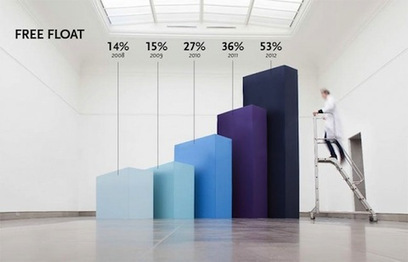
Belgian studio Coming Soon is all about making it big. Their Hand Lettering creations filled a giant chalkboard with letters in a variety of fonts and styles. And with Infographics XXXL, they’ve taken actual graphs and blown them up to a huge size for a client that specializes in the research of nanobodies.

The result is that, instead of casually glancing at the same old pie chart or bar graph, shareholders have something to keep their gaze on the numbers, like a blurry scientist walking by human-size bars or holding up a literal piece of the pie.


See a selection of Coming Soon’s giant infographics at the article link.


Via Lauren Moss
Jennie Munson's comment, May 1, 2013 10:57 AM
very cool